Prio One
with forpeople
Creative Direction: Patrick Niall
Brand Strategy & Copywriting: Alicia Mitchell
Design: Tito Long, Anete Sabule, Mia Sinovec, Sven Zijderveld
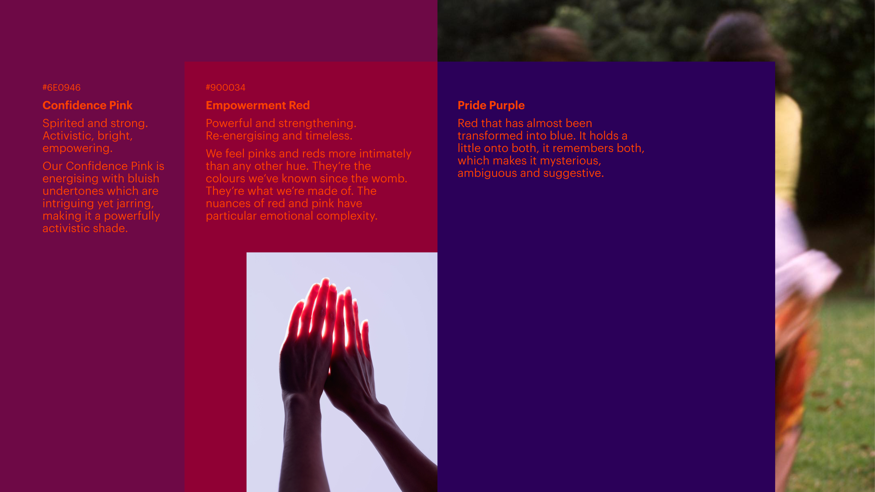
Many women all around the world face a wide range of pressures and issues preventing them from receiving the support they need for their gynaecological health. No matter what it is that we are facing, we all need a helping hand to prioritise our health.
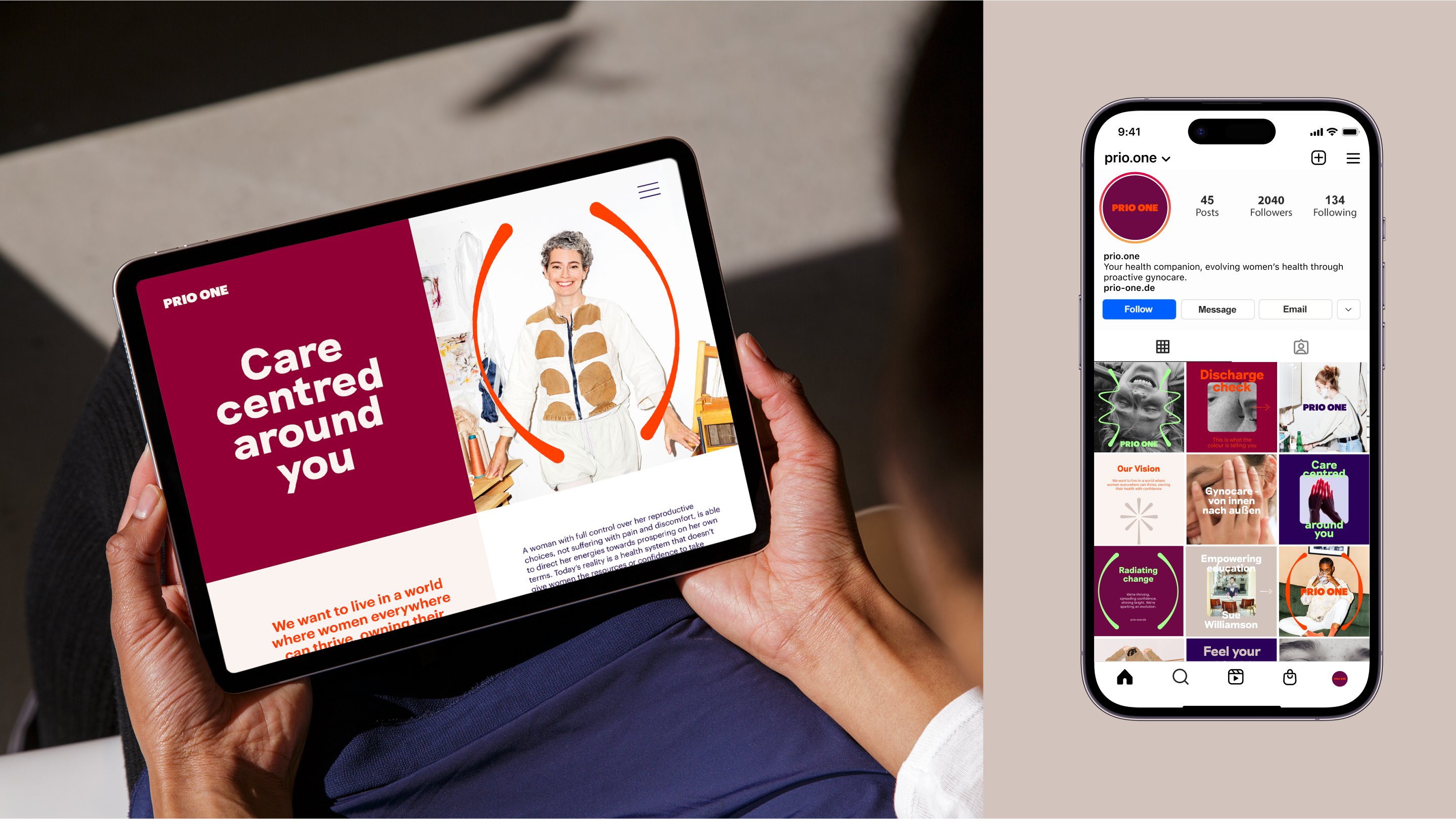
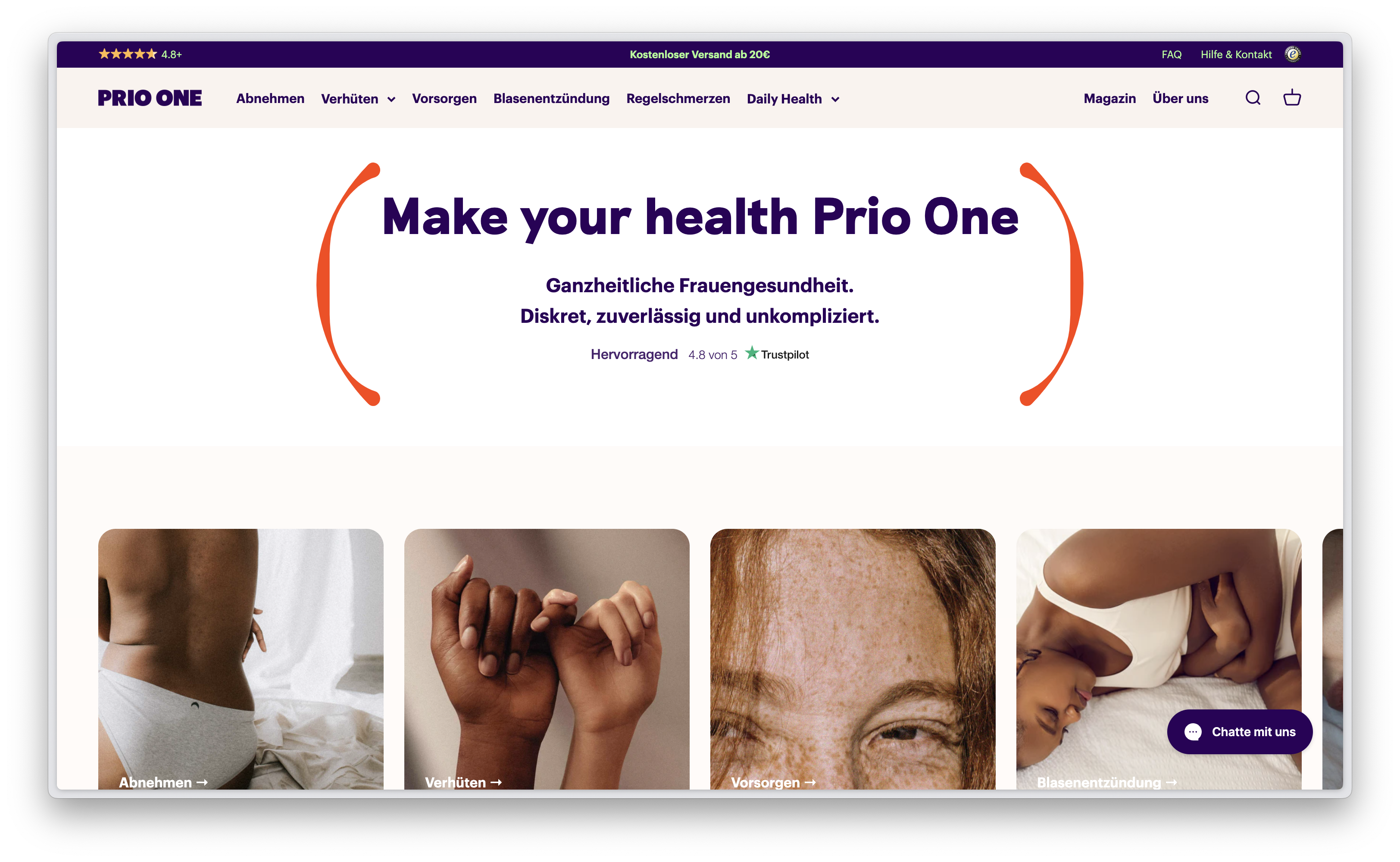
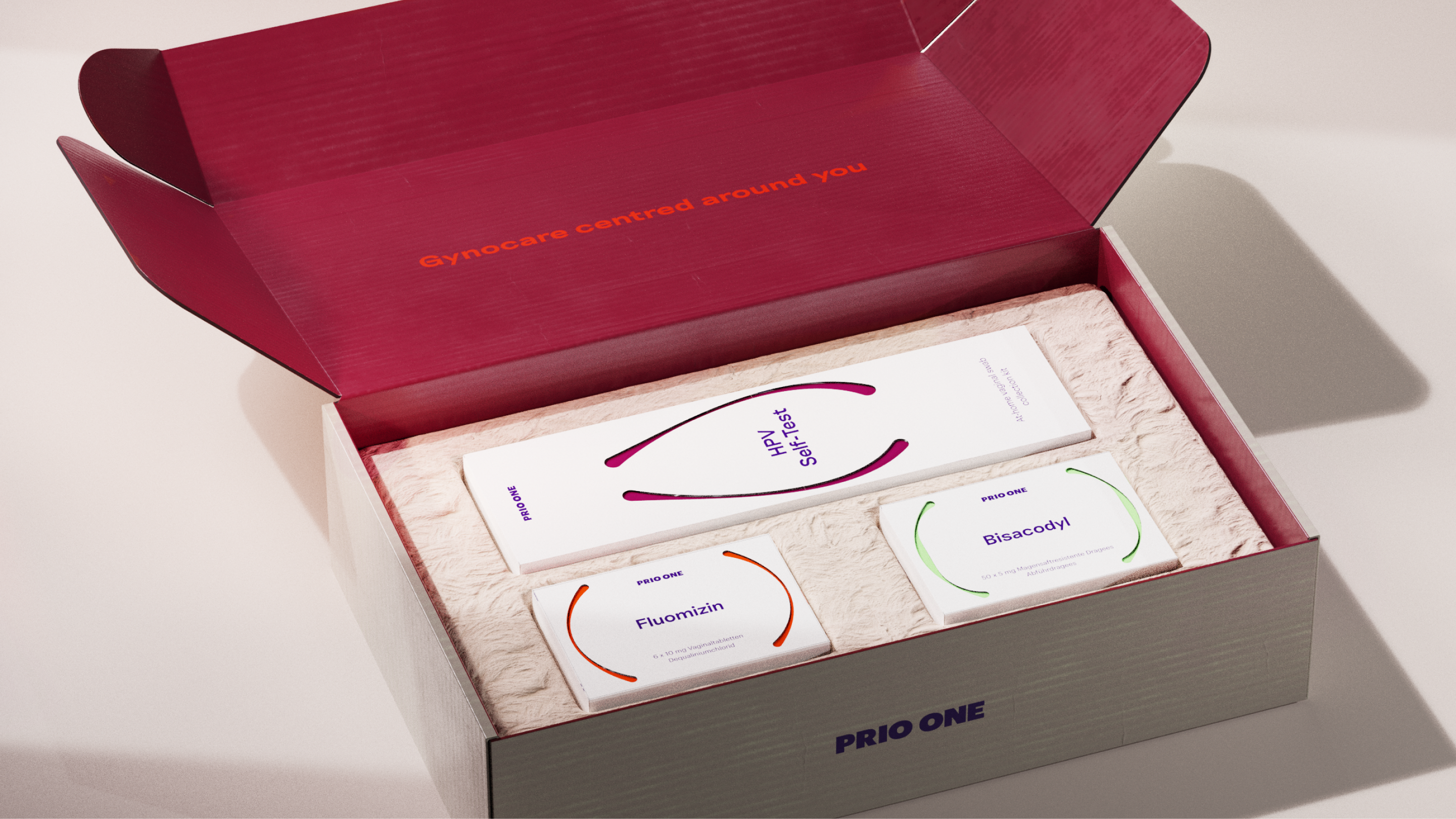
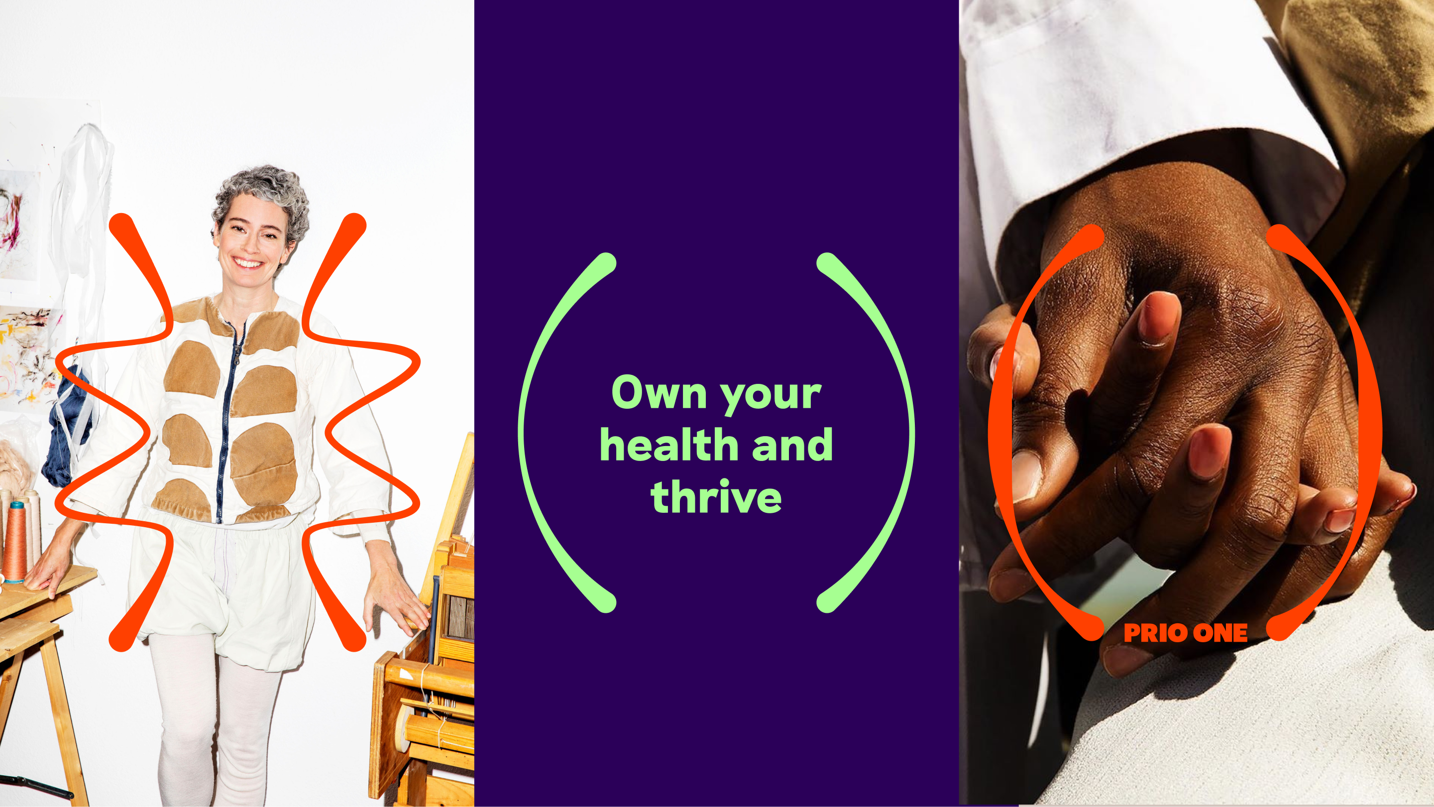
Prio One’s goal is to amplify women’s power by shaping healthcare around individuals. Because we want to live in a world where women everywhere can thrive and own their health with confidence.
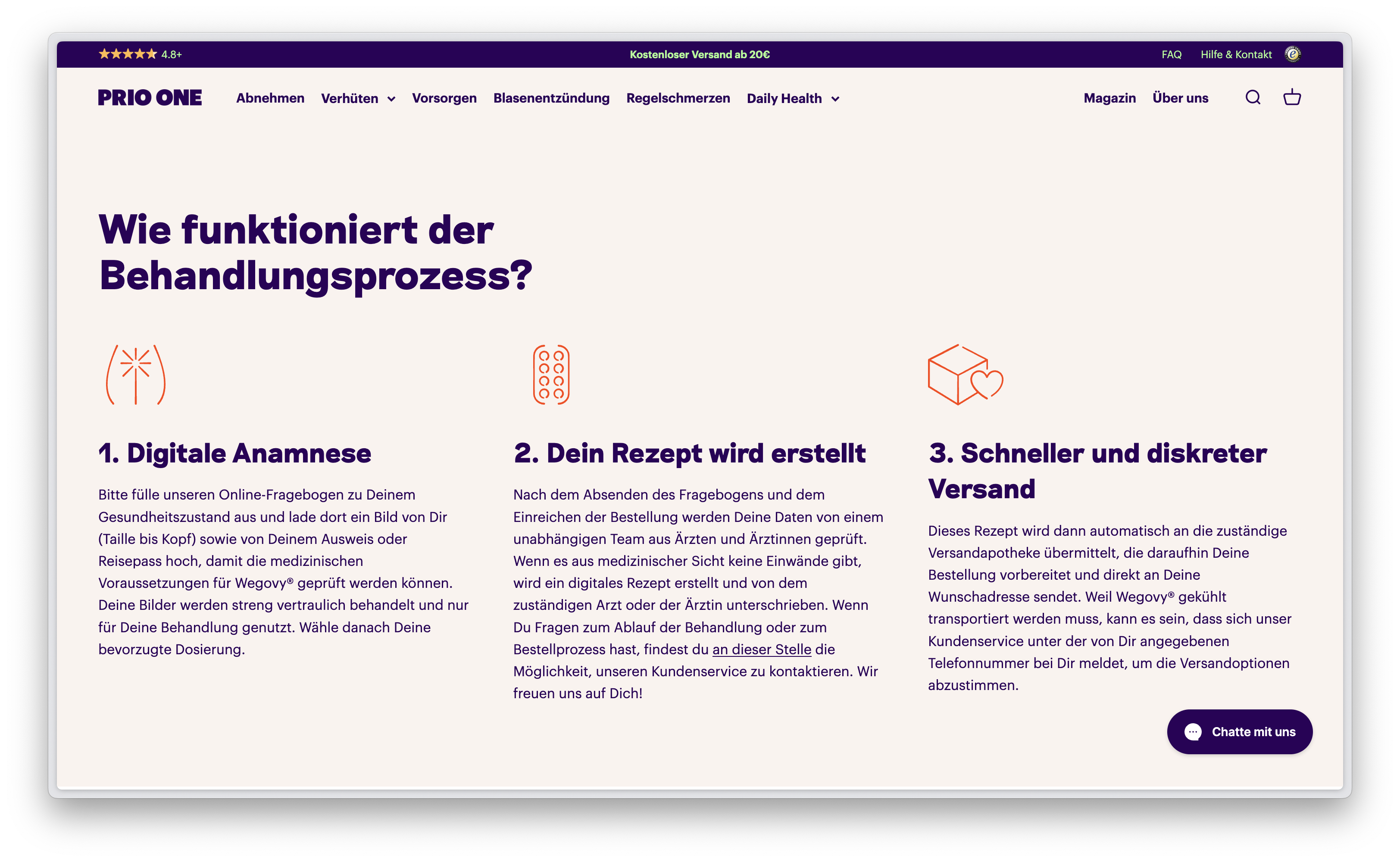
They aim to complement and enhance face-to-face treatment through patient-centric approaches and solution. Going beyond the treatment of acute needs, they aim for life-long proactive education and management relating to gynaecological health, to form a powerful foundation for overall health and happiness.
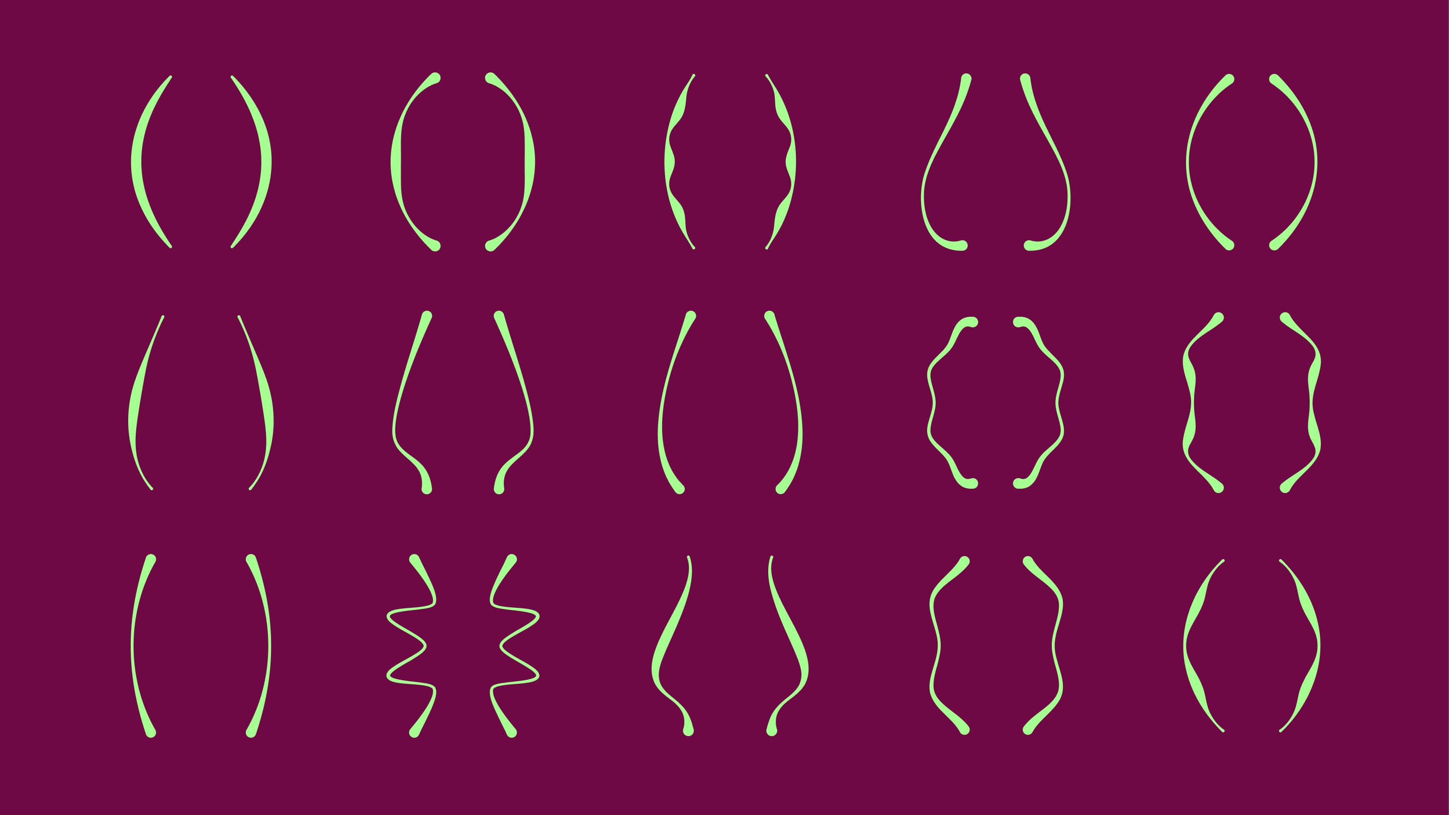
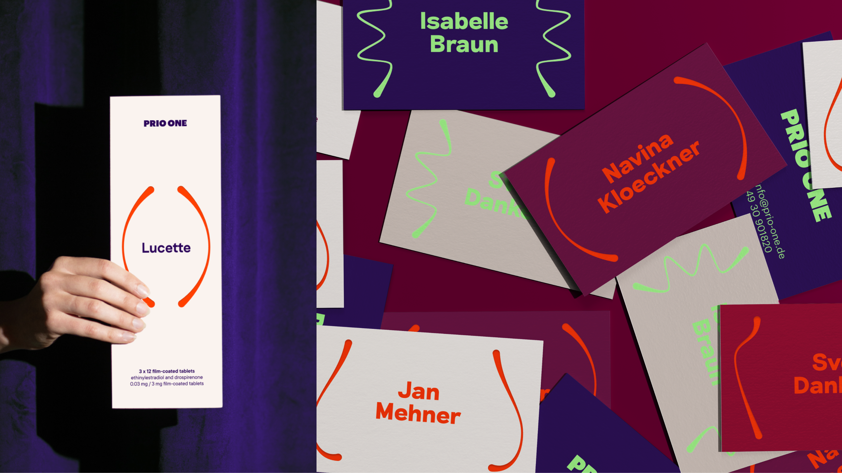
A subtle tweak of the leg of the R and the diagonal stroke of the N hint to the gynoframe and add a unique element to the wordmark.
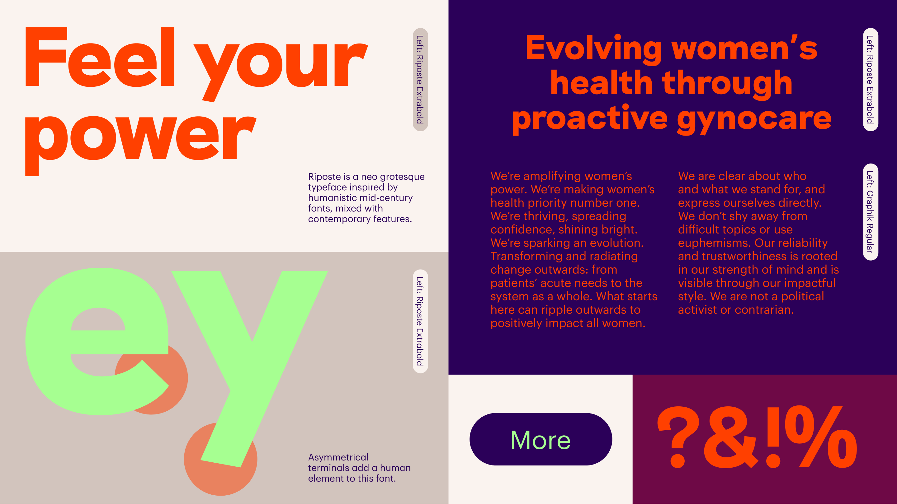
Together they bring out a friendly and trustworthy, yet energetic feeling.