On the practice of self-tracking, documenting and archiving, and the need for interpreting data
Originally written in 2021, edited in 2023
This essay is a research and companion piece to Drawn from Data
Due to my own consistent logging efforts, six months of my life are now documented through charts. What started as a table that I drew on an A4 sheet with a felt-tip pen, has later become a growing printable template, with new columns added as time went on. And today it lives digitally, on my computer. A spreadsheet at first, then turned into code to ultimately be turned into a series of artworks.
I started to log during what I would now describe as a bit of a rough patch at the start of 2021. Any semblance of a routine had been slowly disintegrating and days were starting to slip away. I wanted to get back on track. I wanted to become that person to make the bed in the morning–that’s something I’m supposed to be doing, right? And this meant trying to take very basic human things very seriously. Waking up and going to bed at regular hours and doing it consistently. Three meals a day – breakfast, lunch, dinner. Leaving the apartment, going outside, taking vitamins. Brushing my teeth, taking a shower.
I taped the A4 papers with my monthly felt-tip pen-drawn tables next to my bedroom door to fill them out upon waking up and before going to bed. It became a ritual of sorts. And I started all this with no knowledge of the term quantified self, which I learned of later when I mentioned mt tracking efforts to a friend. I wasn’t trying to quantify my being, to turn myself into numbers. But I also didn’t know what the term really meant.
The Quantified Self
I didn’t really know that what I was doing at the time had a name. See, I didn’t necessarily want to have myself be quantified, but I’ve always enjoyed data and patterns. I wasn’t trying to fully quantify my entire being. But I suppose, some small part of it, in some strange way, I did. I wanted to know if there was a pattern I could strengthen, or if there was one that I could break.
The Quantified Self website states that “The Quantified Self is an international community of users and makers of self-tracking tools who share an interest in ‘self-knowledge through numbers,’” and Melanie Swan, in her 2013 paper on the topic describes the quantified self as “any individual engaged in the self-tracking of any kind of biological, physical, behavioural, or environmental information.” She also points out that health is often an important focus, although not always the only one. Oftentimes self-tracking serves as the way towards improvement and is done through various ways of logging the data.
In recent years, wearable devices (such as smart watches and sports trackers) have become very accessible and there are various apps available (according to Deborah Lupton’s 2016 article, there were over 160.000 of them on the market at that time), which help with the task of logging and tracking, but they do not necessarily have to be used. Some log their data manually, like I did, with pen on a piece of paper, or digitally in a spreadsheet.
“But I don’t do that”
So, by all means, and according to Swan’s definition of the quantified self, this is what I had been doing for the last few months. Except, the more I learned about this idea, the more I was starting to feel a certain kind of disconnect to what I read. I imagined sport- and health-obsessed people with their fitness watches and fit trackers. I understand that’s not all there is to self-tracking, and that I was creating a slightly reductive idea, but I couldn’t help but feel that that was definitely not what I was doing.
Even though I did (and still do) use some tracking tools and apps, and it’s interesting to check how many steps I did in a day, it’s way less fun to check how many hours I spent looking at my phone screen. At the time, I was merely logging. My first step was just to note and see what was going on. I was writing down my waking-up and going-to-bed hours, adding checkmarks to the breakfast, lunch, and dinner columns. I wasn’t really painstakingly trying to improve myself and I didn’t beat myself up whenever there was a tick missing. Not doing my bed every morning had no real consequence for me.
What had started as an, at times admittedly futile, attempt at self-improvement, turned into an almost ritualistic routine. I did start with some goal in mind, I did start wanting to get better, be better, do better. And I continued just because it became something that I did. In the evening I had a few moments to think back on my day. Maybe I would note down a cute dog I saw on my daily leaving-my-room walk. And what I didn’t know, or think about at the time, but is now clearer in retrospect, is that even though I started with a goal, perhaps I didn’t use my tracking to analyse, as much as I did to merely document.
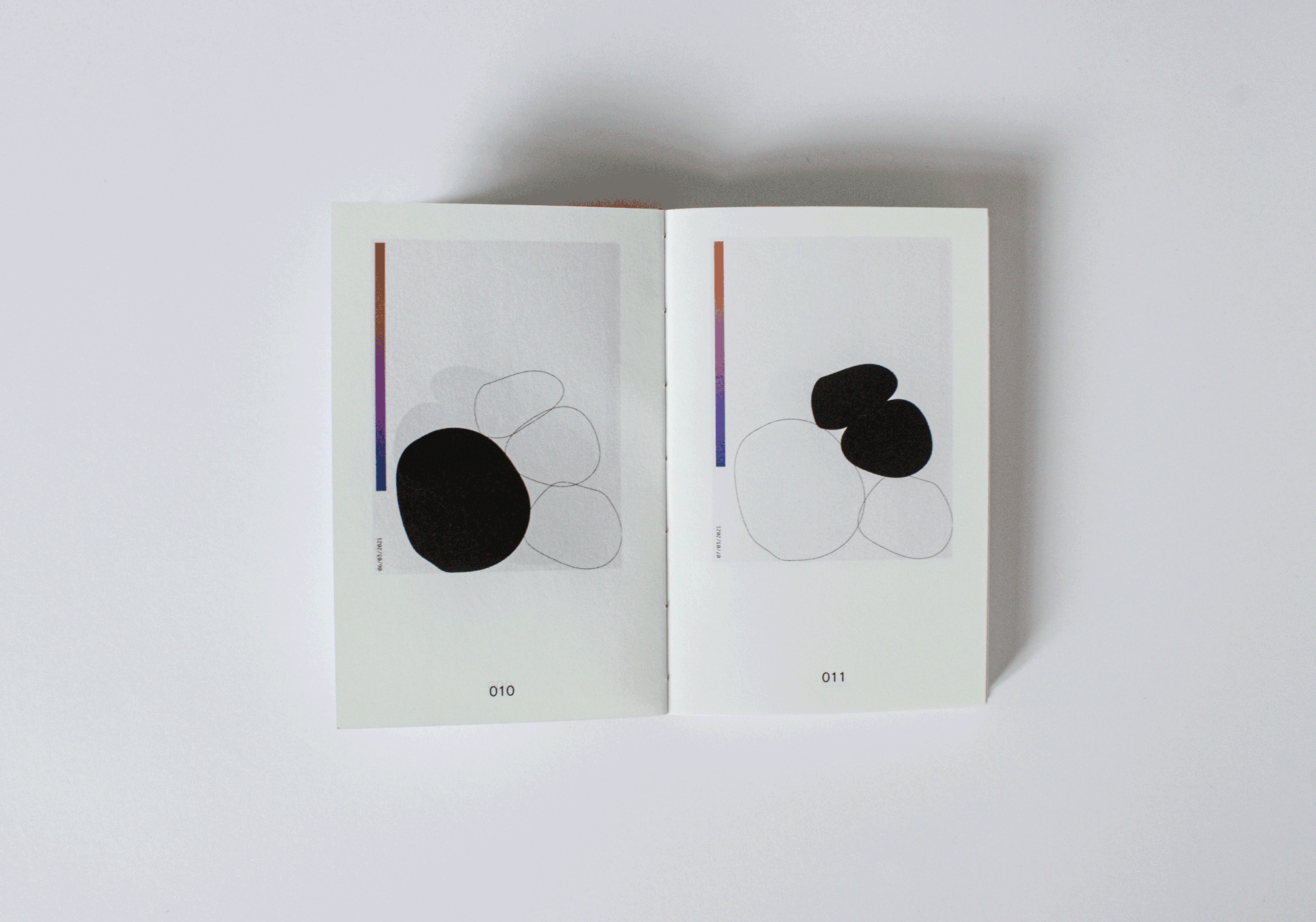
I’ve seen a wonderful example of documentary data visualisations in Giorgia Lupi and Stefanie Posavec’s project Dear Data. Each week, they picked an overarching theme or topic within their daily lives, and they kept track of it. They drew their weeks in visually interesting ways on postcards, which they sent to each other for a year. The correspondence can now be looked at as documentary, as well as an archive of the time in their lives during which the project took place.
And just like Garry Winogrand, the American street photographer, who said “I photograph to see what the world looks like in photographs,” maybe I logged just to see what my months looked like in data.
Self-tracking efforts become a design project
In addressing my own experiences with self-tracking, the following questions, which became the basis of my research, came to mind:
- Can day-to-day self-quantification be used as a tool for reflection instead of improvement and optimisation, and how?
- How can the collected data be used for the purpose of archiving instead of analysing?
- How can self-quantifying become a practice that isn’t rooted in the search for perfection?
However, approaching my own data (and archive) as a design project presented as a challenge. I thought of my logs as somewhat sacred and the thought of sharing my personal hygiene habits, among other things I had been keeping track of, did not exactly fill me with any sense of excitement. But that was the data I had and it seemed like the step to take. Already early on in the project the questions of how my data is going to be seen and interpreted started to take shape, albeit a vague one at the very start. This later became a topic I dove deeper into.
In the project I sought out to do the following:
- Visualise my own data collection. I wanted to do it in a way that is somewhat abstracted as to not immediately reveal the exact data tracked, but could still be read using a key. I also wanted it to be visually pleasing, for each day to be a stand-alone artwork of sorts.
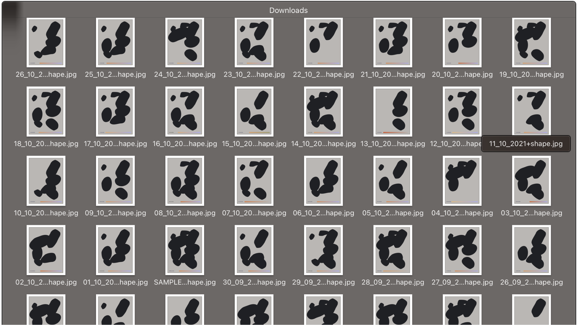
- Develop a way for such visualisations to be generated. I had 180 days worth of data to visualise and I wanted to try my hand at automating the process.
So, then, what does life look like in data?
The question is a spin on the aforementioned Garry Winogrand quote. When taking pictures, all he seems to be interested in was just that; taking pictures and then seeing the pictures he took. He stated that he wanted to photograph what he found interesting.
Ian Bogost, in his video about Winogrand, says about this practice that “His works are not commentaries, they are precisely the opposite. Garry Winogrand makes photographs not to capture what he sees, but to see what he will have captured.” When discussing the subjects of the photographs, he notes that “they are there just because they were there. Because light bent through an aperture onto emulsion. Because Winogrand is a person and people sometimes find themselves at press conferences and zoos and rodeos. Just because.”
What happens if Winogrand’s approach to the subjects of his photographs is to be applied to how we look at data? Most times, and even by definition, data is the subject of analysis. In fact, the Merriam-Webster dictionary defines data as “facts or information used usually to calculate, analyze, or plan something.” It is something we draw conclusions from, something to be interpreted.
But, if that is not what one chooses to do with data, is the data itself then rendered useless? Pointless, even? Is it then, by definition, not really even data anymore?
Visualising my data
When visualising my data, I went through many iterations of what the final outcome could look like, some of which can be seen below. I did not set many limitations for myself, the only criteria I had to follow was that every activity I tracked would be visually represented somehow, let it be by an individual shape or a changing gradient.
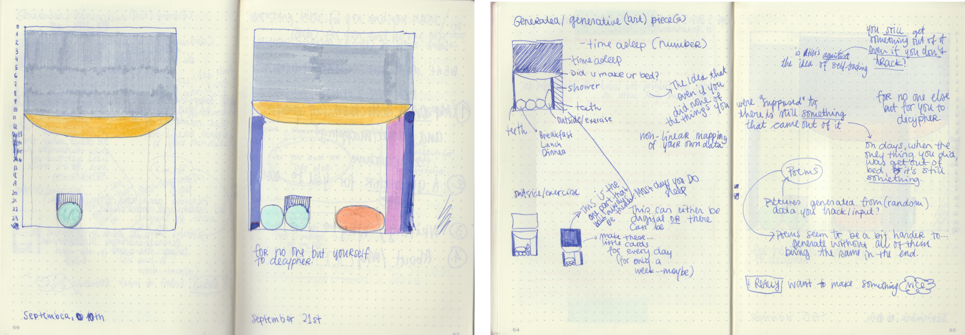
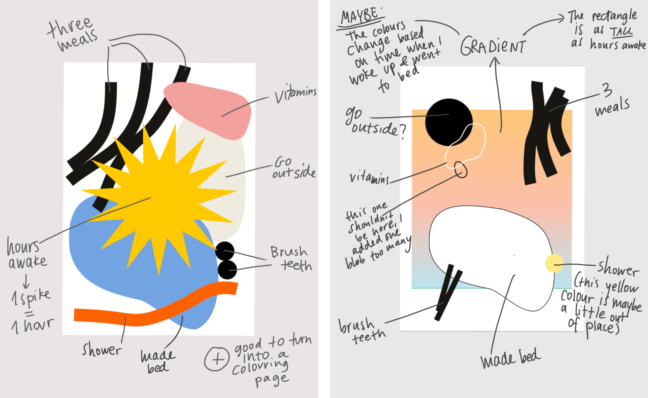
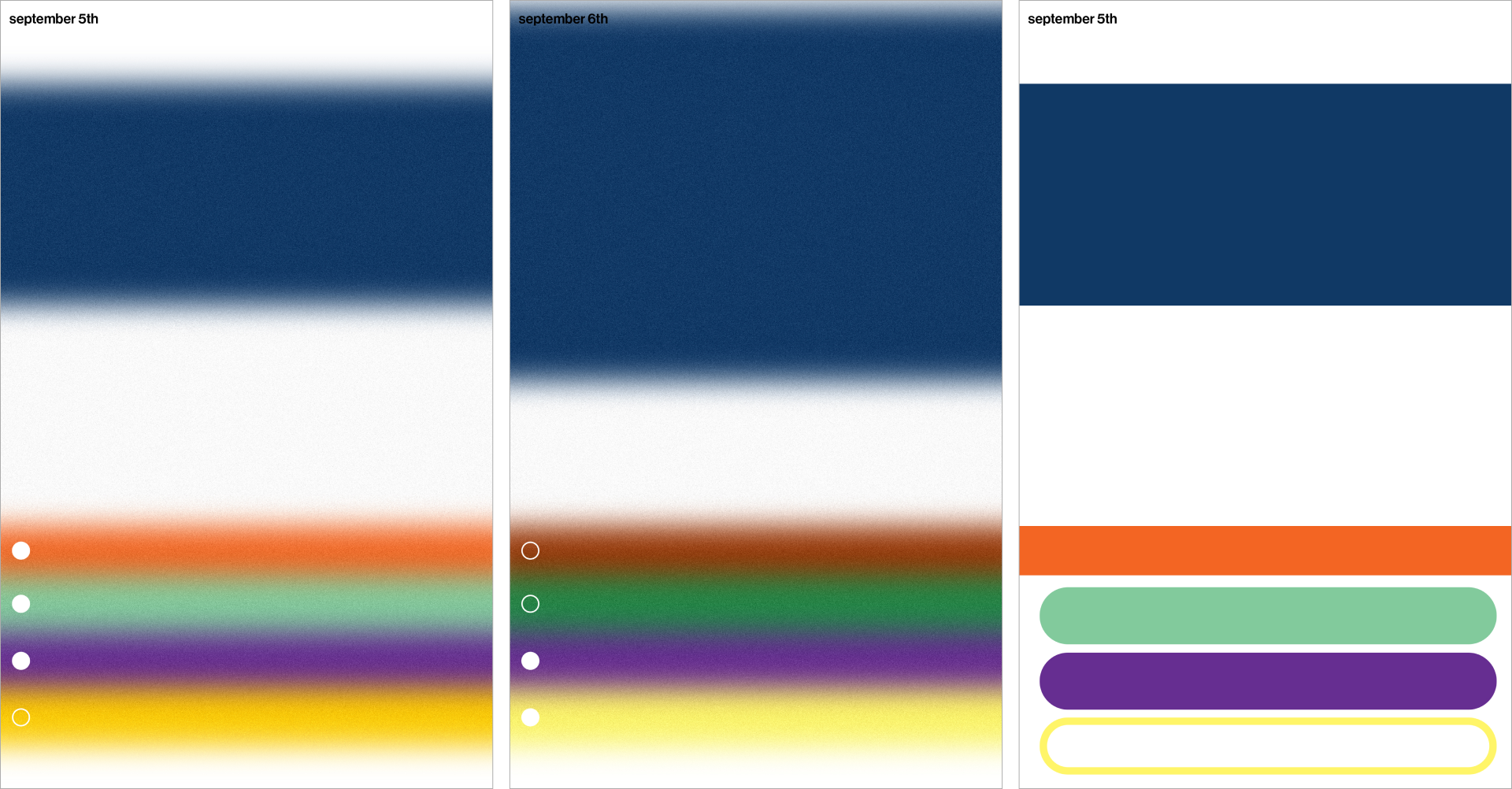
I also chose a more abstract and illustration-like approach because I didn’t want the final graphic to be immediately deciphered. However, there is still logic to what each element represents and the final images are not composed randomly. The inclusion of a key on how to read the image makes sense, but regardless of how the entire collection of images is presented in the end, I decided that the key shouldn’t be the first thing to see. The images should.
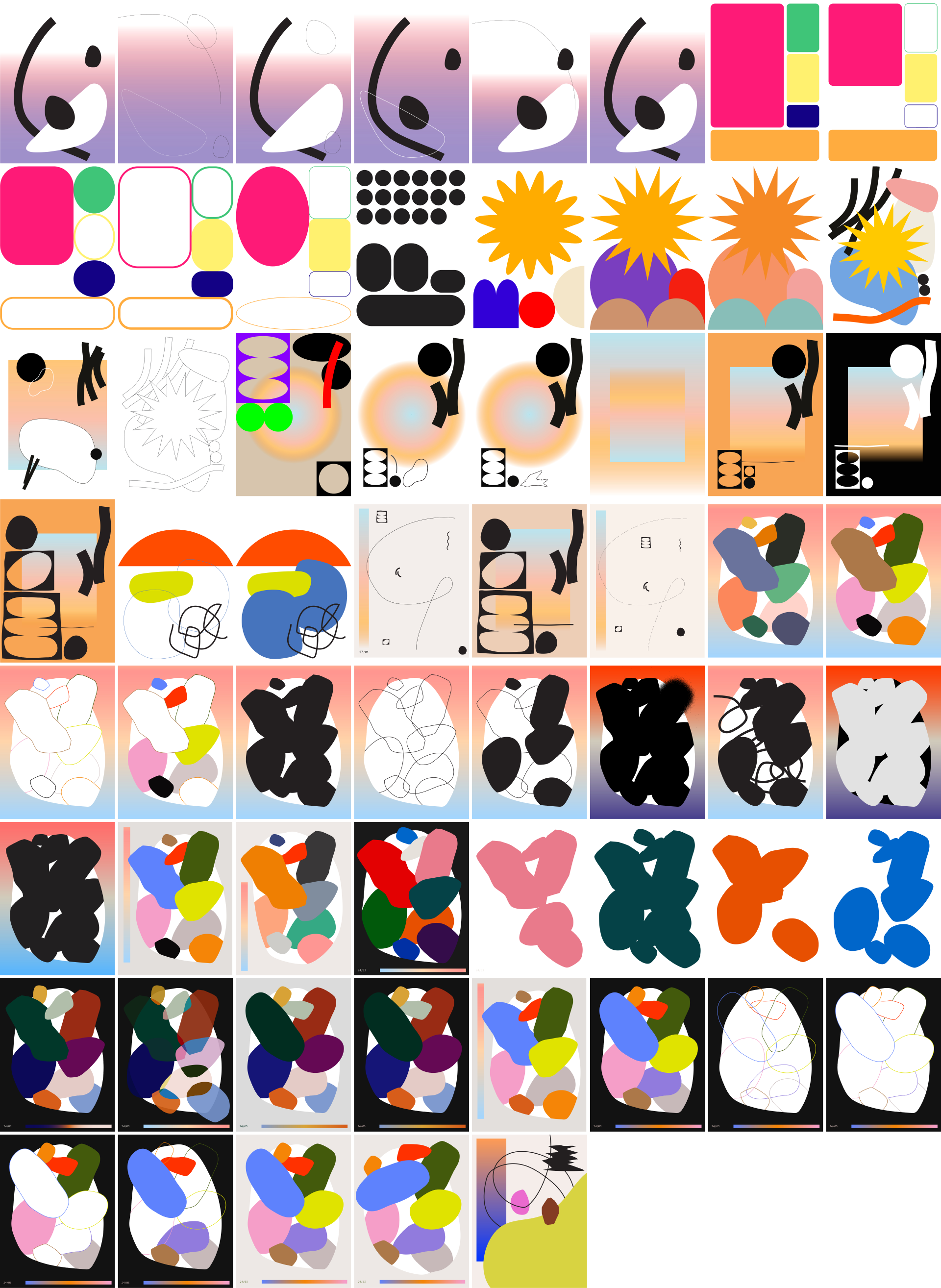
The images are generated, as I had initially set out to do, which was mainly for practical reasons, as a large batch of data can be processed quickly and the final outcome can be modified with relative ease. Visual elements can be swapped out and repositioned by changing a few lines of code. All images will follow the exact same key and as long as there are no errors in the data that is used as an input, the final outcome is consistent throughout. Additionally, it opens up a possibility to share this tool with others. It could then be adapted to each individual’s needs and desires. For example, someone might want to use different elements to represent certain data, and because a framework already exists, this can be, again, done with relative ease.
Interpretation and drawing conclusions
In her critique of the quantified self, Alexia Boiteau questions whether the quest for self-improvement is worth it. She writes about how representing through data can lead to oversimplification which in turn could lead to a reductive picture of oneself or the world at large. “The body and the self become represented as an archive of identifiable, storable and processable data, numbers and values.”
I wondered if presenting data points solely with pretty shapes and colours would also be a reductive strategy? When starting the project, I felt quite strongly about not being presented as a set of numbers, ones and zeros, but wouldn’t this then be just a slightly different version of it? I would now say that’s not the case. Because the intention of the end product is not to (primarily) and directly serve as a representation, but rather it is an end product that comes along with self-tracking activities. A result that doesn’t aim to push for any sort of determined outcome.
Again, in line with Winogrand’s work, there are no conclusions to necessarily be drawn from the images generated from my data collection. At least that is not their intent. There is no definitive conclusion, and the extent of their interpretation doesn’t stretch beyond defining and decoding what each individual element of the graphic represents. They are there just because.
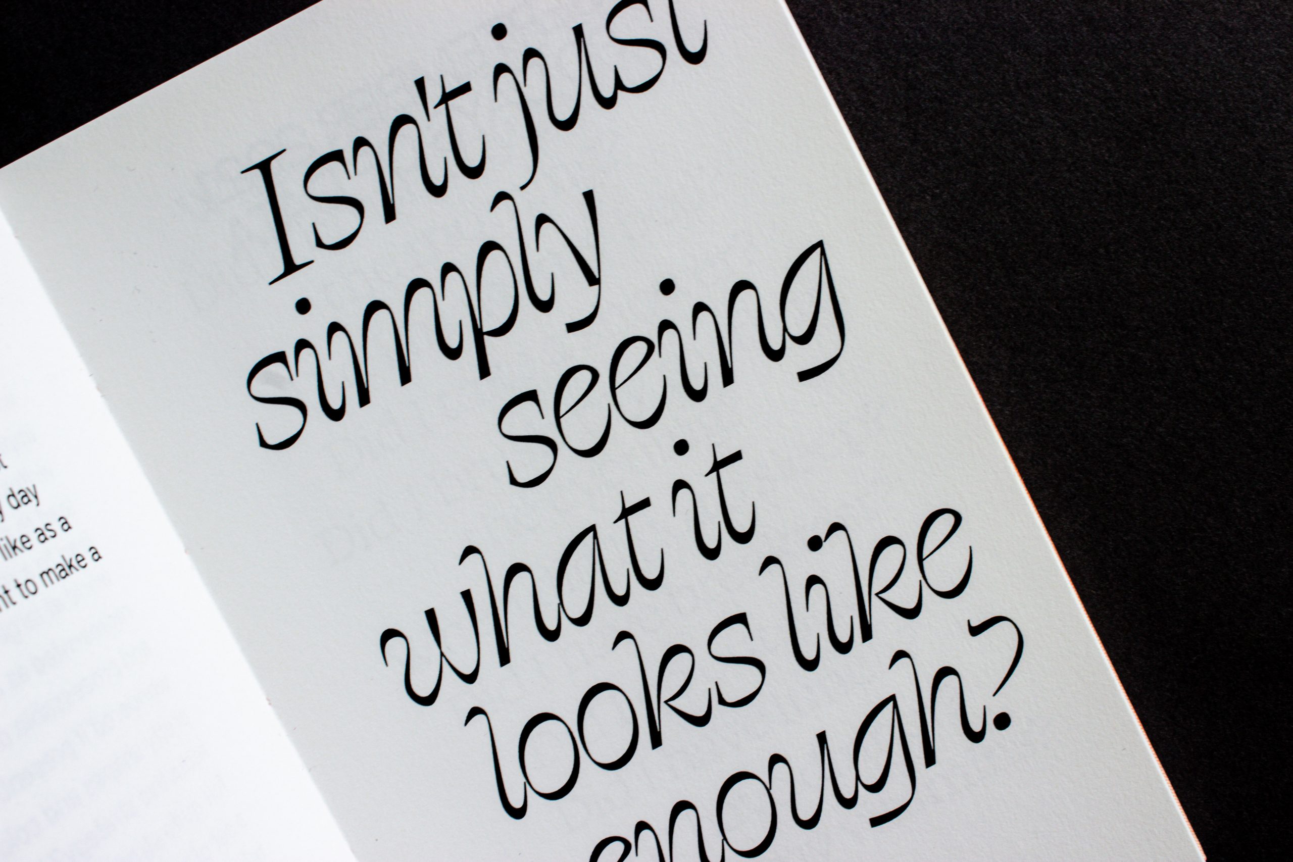
And if I only want to see what my day or month or the world around me looks like as a visual representation of data, do I want to make a conclusion after I’ve seen it? Isn’t just simply seeing what it looks like enough?
Did I find answers?
Did I find answers to the questions about the possibilities of a reflective, archival, and non-analytical approach to the practice of self-tracking? I would like to think that in some small, unique way, I did. However, new questions emerged along the way, as they often do.
From this experience, I believe the overarching answer to the questions I asked right at the start lies in the practice of tracking itself. To make the action of logging a routine, a ritual in of itself. The data produced at the end of a period of self-tracking can exist as a result of the action and the effort to log it, but not for any further analysis or interpretation. It is then not seen as the end goal, but almost as a byproduct.
And how said data is later presented also follows the same idea. If it is displayed in a more abstracted manner, the innate desire to find patterns or possible explanations within it can be deterred. However, doing so, by definition, defeats the purpose of data, which is for it to be analysed and interpreted. But I think that perhaps sometimes data should also be allowed to merely exist.
Designing data or designing with data?
I understand that there is a certain irony in stating that data shouldn’t be interpreted. And especially when making that statement in the conclusion of my final paper of the Data Design minor, since the interpretation of data is arguably the cornerstone of the practice. Of course I don’t think data shouldn’t be interpreted at all. It should be, that is after all its main purpose. But within this project, it made sense to question and explore the possibility of overlooking the core function of data in order to see what else it could offer.
When data is treated as both the material to design with and the content of a final outcome, it can be shaped in ways that tell stories and offer new insights, and that’s the power data designers hold. And I think these core principles should also be examined and looked at from a different angle from time to time. In order to do that, this project and its research combine multiple approaches in order to answer my initial questions.
The first step, and the basis for everything I created from there on, was examining my own data archive. Although the questions I asked at the start pertained to a larger phenomenon, the project itself was also quite personal to me, since it revolved around the activity I had been partaking in.
The next step was to do something with the data. The obvious answer followed – visualise it. My visualisations went through many phases and the intermediate step of seeing all of the initial visualisations brought about the questions that kept me busy throughout the projects, those being the questions of interpretation.
Conclusion, reflection and final thoughts
Being introduced to the work and approach of Garry Winogrand was a seminal point of this whole project. To branch out of the world of design and find so many similarities in approach from someone in the field of photography was really refreshing. As I have already mentioned throughout this paper, the idea of taking pictures just to see them really informed a lot of how I continued to think about my own project. It led me to examine what data is, how we treat it, and what else it could be.
And now, at the end of it all, I can look back on the last few months of work to try and draw some conclusion. Over the course of this project I wrecked my brain over what the statement I wanted to solidify was. What was my thesis? What was I defending here?
On one hand, there is the seeming inevitability of being datafied. With enough attention and enough effort, my every move, my every thought, intention, feeling, breath could become a data point. Every letter I type, every sentiment I express in a sentence. Every time I’m sad or happy. Every ad I click or don’t click on.
But on the other hand, doesn’t that feel reductive? To narrow myself down into a set of actions and yes or no questions? And of course it does because I am a person and not a data point. Like everyone else, I want to believe that there is something uniquely special about me, in particular. And that something, whatever it is, whatever we want to call it, will always be mine and mine alone.
View the final outcome of this project, the book Drawn from Data here.
Sources and references
Boiteau, Alexia. “The dark side of self-tracking.” Fabrique, 21 Feb. 2020, https://www.fabrique.nl/blog/ 2020/2/dark-side-self-tracking.
“Data.” Merriam-Webster.com Dictionary, Merriam-Webster, https://www.merriam-webster.com/dictionary/data. Accessed 29 Nov. 2021.
Diamonstein, Barbaralee. “An Interview with Garry Winogrand (1981).” AMERICAN SUBURB X, 2008, https://americansuburbx.com/2008/10/theory-interview-with-garry-winogrand.html. Originally published in Visions and Images: American Photographers on Photography, Interviews with photographers, 1981.
Fraenkel Gallery. “Garry Winogrand.” Fraenkel Gallery, https://fraenkelgallery.com/artists/garry-winogrand. Accessed 29 Nov. 2021.
Lupi, Giorgia, and Stefanie Posavec. Dear Data. Princeton Architectural Press, 2016.
Lupton, Deborah. “Self-Tracking, Health and Medicine.” Health Sociology Review, vol. 26, no. 1, 2016, pp. 1–5, doi:10.1080/14461242.2016.1228149.
“Seeing Things – OOOIII.” Vimeo, uploaded by Ian Bogost, 15 Sept. 2011, https://vimeo.com/29092112.
Swan, Melanie. “The Quantified Self: Fundamental Disruption in Big Data Science and Biological Discovery.” Big Data, vol. 1, no. 2, 2013, pp. 85–99, doi:10.1089/big.2012.0002.
“What is Quantified Self?” Quantified Self, https://quantifiedself.com/about/what-is-quantified-self/. Accessed 14 Nov. 2021.
Author’s note: I first wrote this text in 2021 as a part of the Data Design minor while studying graphic design at the Willem de Kooning Academy. My fascination with this topic persists and I felt an urge to revisit it. It has been edited for clarity, with minor changes omitting some details pertaining to assignment criteria. Apart from those adjustments, the central themes remain the same.