Woodoo
with forpeople
Creative Direction: Jack Merrell, Patrick Niall
Brand Strategy & Copywriting: Patrick Niall
Design: Gaetan Ferhah, Santa Kupča, Tito Long, Anete Sabule, Mia Sinovec, Sven Zijderveld
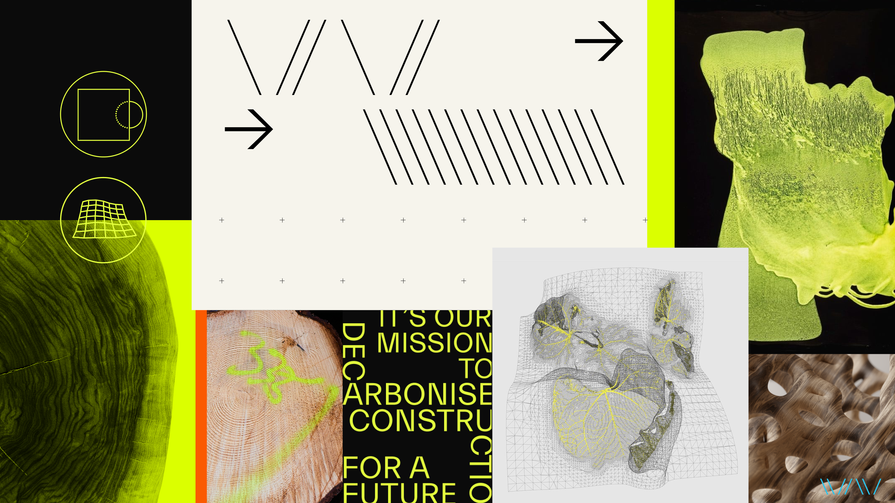
Woodoo is a french startup with a mission to decarbonise construction. In partnership with nature, for a future build on wood. Their innovation focuses on augmenting wood to develop alternatives to glass, plastics, and concrete. They transform low-quality wood into advanced, high-performance, decarbonised materials to unlock new potential for designing and constructing the products, places, and experiences of the future.
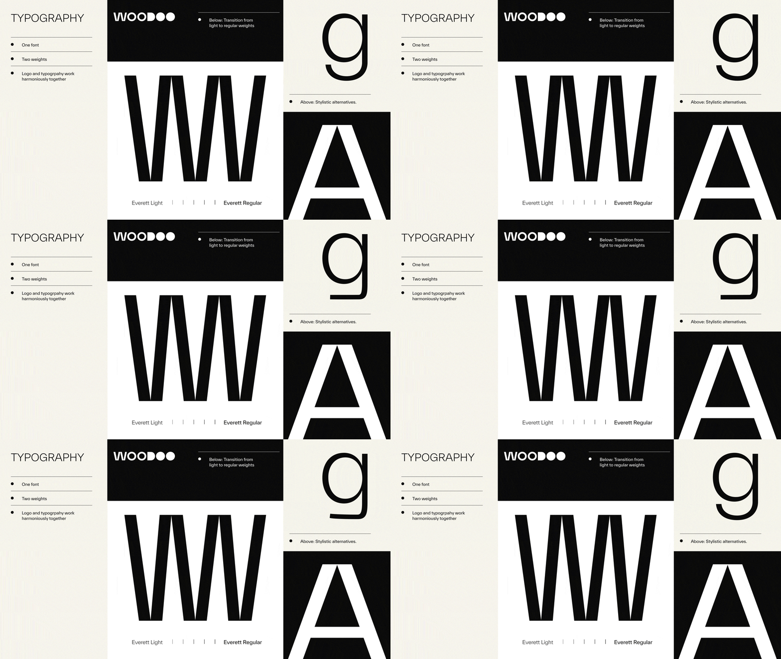
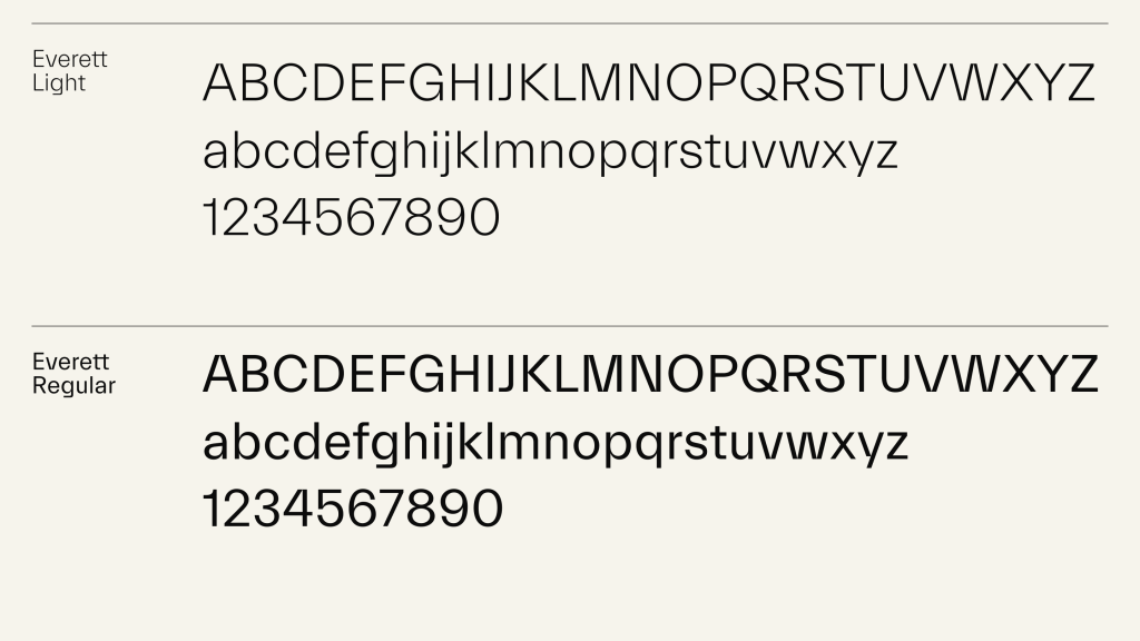
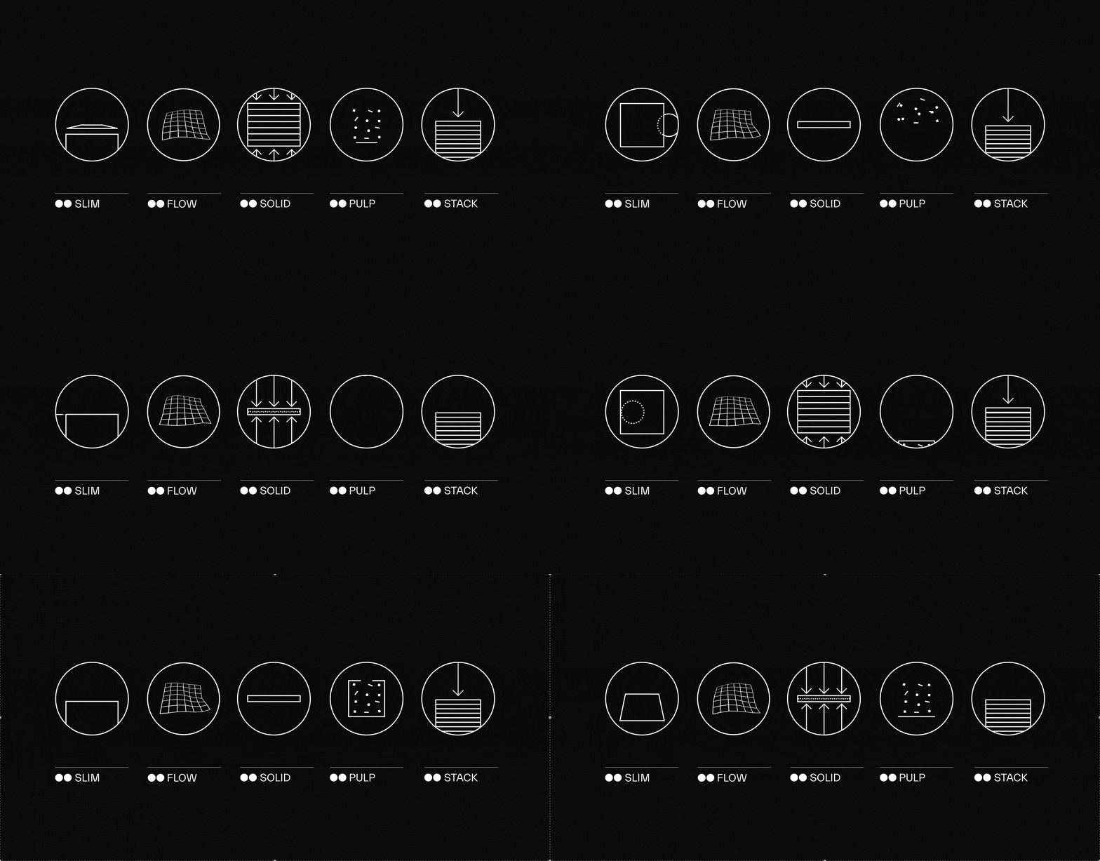
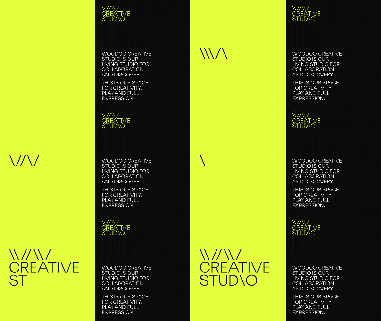
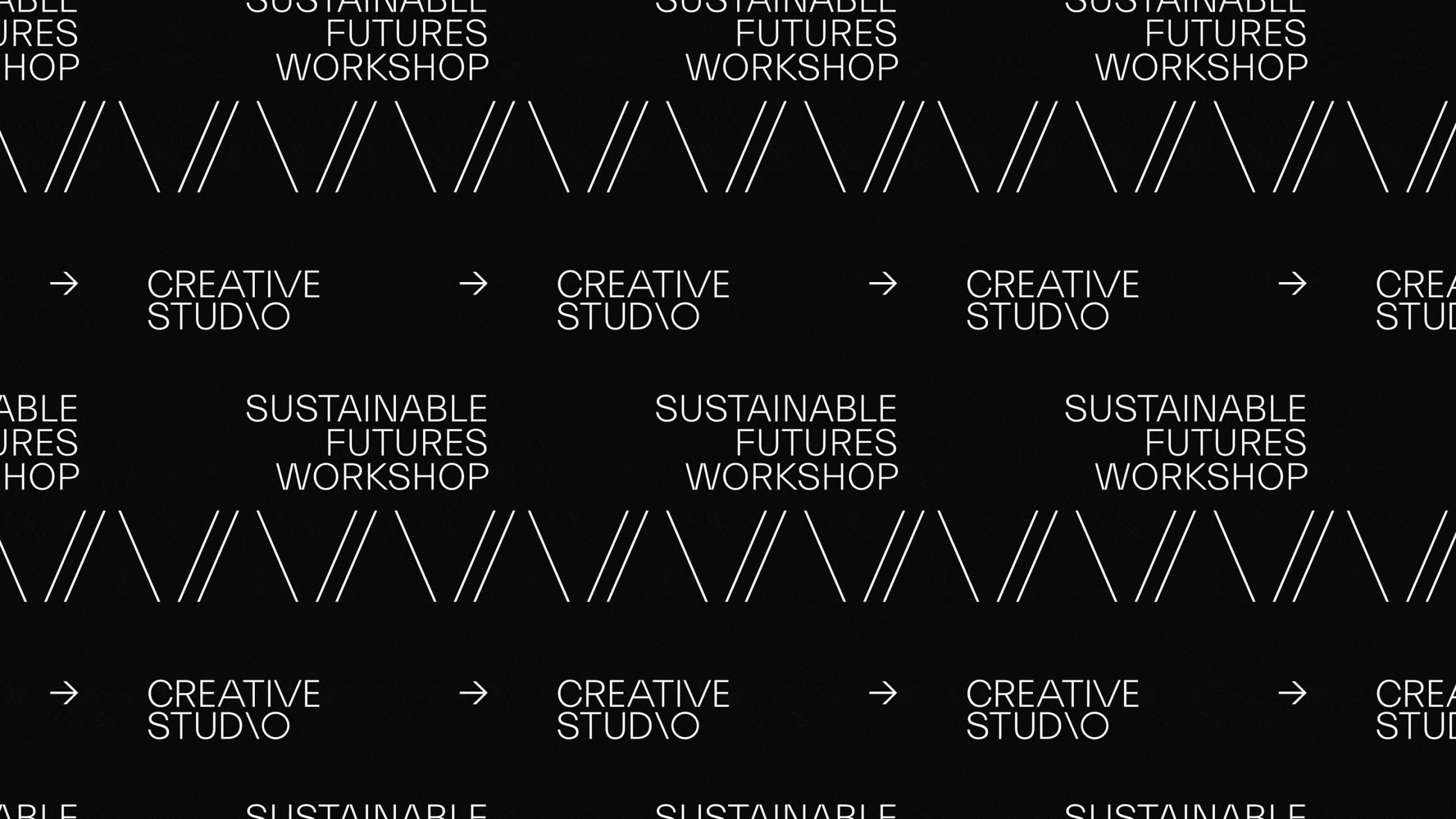
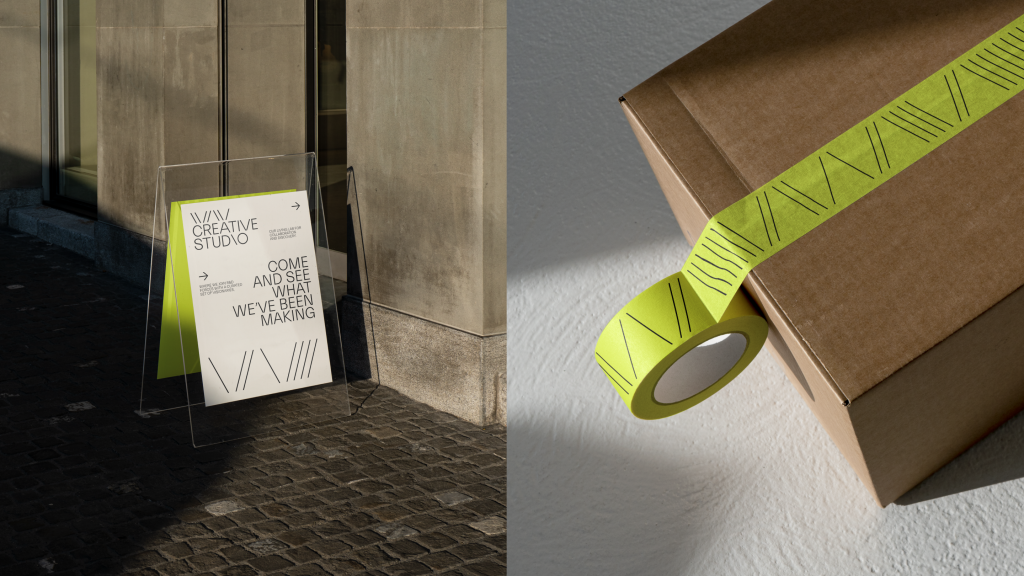
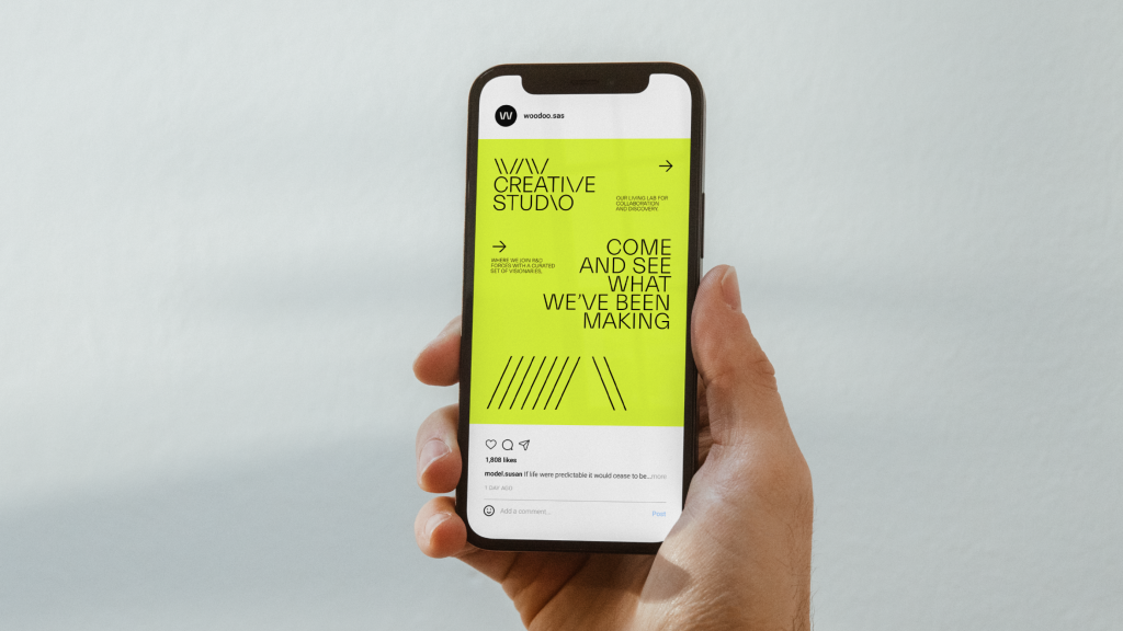
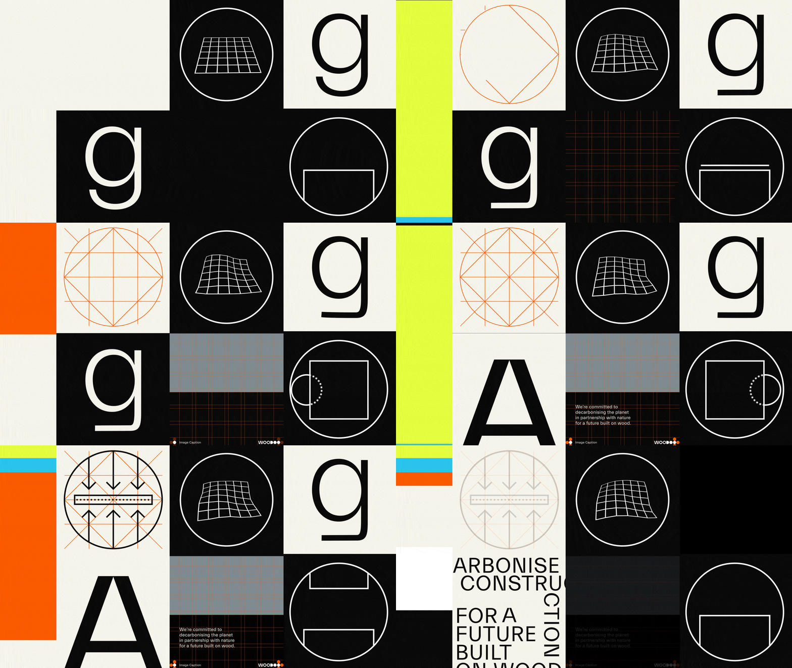
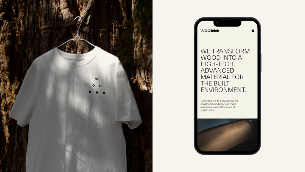
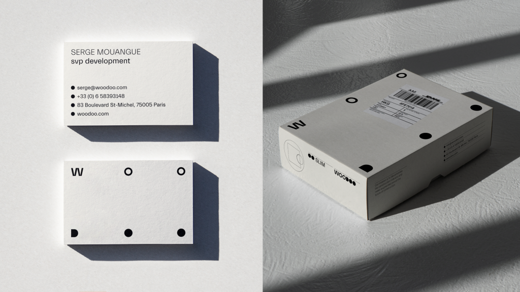
Together with the creative team at forpeople Amsterdam, we updated their brand identity to better reflect their vision and values, as well as their position within the industry of material innovation. We reimagined their visual branding and brand positioning in accordance with their future-facing mission.

